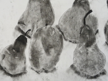
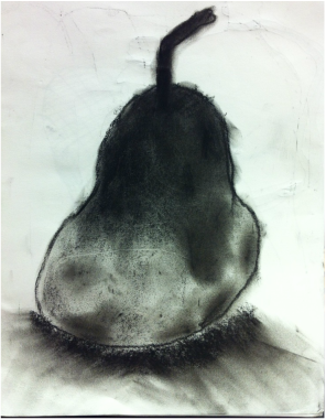
For the past week and a half, my art class has been working on a project entitled 'Artists Observe'. In this project, we spent about five class periods on a single observation project. I chose to use charcoal again, as it turned out very well when I drew the pear (see a couple entries down). While I was working, I came across a lot of problems. For example, the first problem I came across was that I got fingerprints all over the paper where I had wanted it to be white. I coped with this by giving the artwork a much more free and casual feel, rather than strong contrasts between the white and dark grays as I was originally hoping for.However, I actually like this possibly better than how I had envisioned my first idea. I still think that I probably could have gotten a bit darker in places, especially the pear on the bottom right. Another problem I came across was the shading of the apple. I discovered very quickly that an apple is shaded very differently than a pear, and instead of a linear shading, it was much more random. I ended up fixing so many mistakes on the apple, that it looks more like the side of the apple I wasn't drawing! One of the last problems I ran into was that I had forgotten to leave highlights in the fruits, and pencil erasers did not work on charcoal, and gum erasers barely had any effect. Therefore, instead of lightening the highlights, I darkened the areas around the highlights to give the illusion that it was a light color, rather than it being surrounded by dark areas. Nonetheless, I think the final product turned out really good, and I am proud of what I made.
 RSS Feed
